New Dataset
This dataset is more complex than the previous ones and may require more neurons and layers. The red and blue dots are also much closer together, so the network needs to learn more precise decision boundaries. You may need several attempts to achieve a good accuracy.
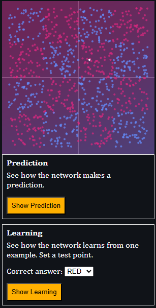
You can now also visualize how the network makes a prediction and how it learns from an example. Use the orange buttons below the plot to step through these processes.
New Visualization
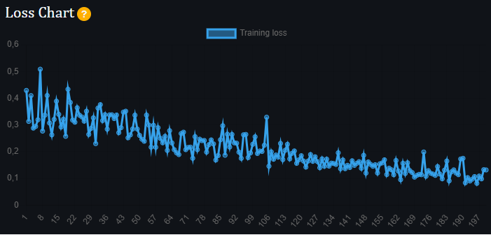
You can now see how the network's loss changes during training. This can give you clues about how the training settings could be improved. For example, large fluctuations without clear improvement may suggest that the learning rate is too high.
New Visualization
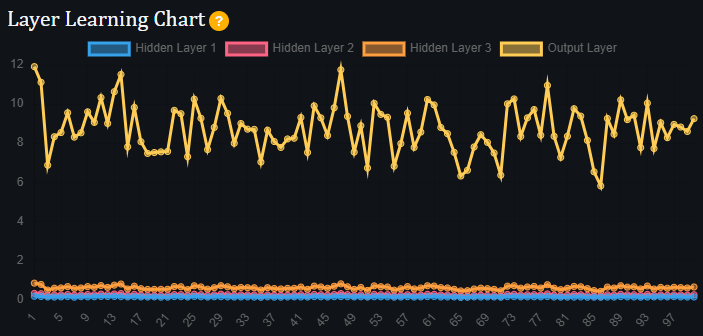
The layer learning chart shows how much each layer of the network is learning. In a healthy network, all layers should contribute to the learning process.
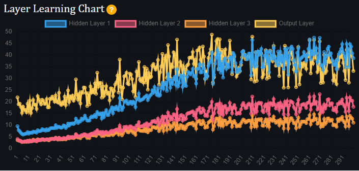
The chart can also help identify possible problems. In this example, many layers are learning very little compared to the output layer, which may indicate that the network is not configured well.
New Configuration Option
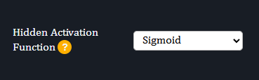
You can now choose from three different activation functions for the hidden layers. Depending on the dataset and network configuration, some activation functions may perform better than others.
Activation functions introduce non-linearity, allowing the network to learn complex patterns. Without them, the network could only create linear decision boundaries.
Try the different options and observe how they affect the training process!